• Our Work
  • Our Story
  • Our Experience
  • Our Services
  • Blog
  • Contact
BRANDING AGENCY
  • Our Work
  • Our Story
  • Our Experience
  • Our Services
  • Blog
  • Contact

MM Kembla 100th Anniversary

Celebrating 100 years of copper manufacturing

MM Kembla recently asked RGC to develop an integrated range of marketing materials to celebrate their 100th anniversary working with the plumbing industry in Australia and overseas.

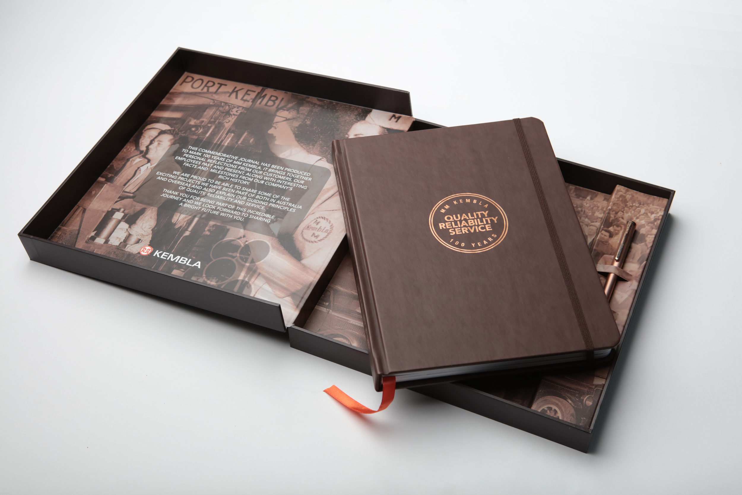
We began by creating a unique “Quality, Reliability and Service” company insignia. The stamp celebrates their anniversary and the founding principles of Kembla copper; quality product, reliability and unrivalled customer service. The new QRS logo was implemented across all digital and print communication.

Then we developed a special commemorative journal which was researched, designed, written and printed by RGC to honour MM Kembla’s rich history showing how important copper has been to the Australia'’s development and the changing shape of the plumbing and construction industries as Australian cities continue to grow. 

Staff and customers past and present also contributed their personal stories and photographs of there work experiences to bring MM Kembla’s history to life. We asked photographer Karl Schwerdtfeger to take engaging black and white portraits of key personnel who had worked for the company for more than 25 years.

The final leatherette bound journal was produced in China and placed into a specially hand-crafted commemorative box lined with a sepia photo-montaged historical image. A limited edition copper pen ball point was also included. The box was presented to key customers who had helped to contribute MM Kembla’s business success over the last 100 years. An exclusive orange version of the journal was also presented to employees at a special commemorative dinner.

K2B.jpg
K4.jpg
Kembla.gif
Source: http://rgcbrandingagency.com/#/mm-kembla-1...
Friday 05.20.16
Posted by Iain Gibson
 

Luana Technology - Making life easier through one point of control. →

Luana Technology asked RGC to create a new brandmark and identity that would engage and attract RTO education providers. They needed to be seen as a leader in the software technology sector and had to cut through the conventions of their category whilst reassuring new customers they had the knowledge and experience to deliver a first class service as well as an application (Student Information System on Salesforce).

Say 'Aloha" to Luana. Australia's first student information system for salesforce.

We began by researching Hawaiian culture, traditions and symbolism. Luana pronounced (Lu-ana) a Hawaiian word meaning ‘enjoyment’ or ‘contentment’ was chosen as the company brand name as it was distinctive and had relevance to the main aim of end user engagement - Making life easier through one point of control. 

In our research phase we were drawn to the simple, natural beauty and distinctive colours of tropical native Hawaiian frangipani (plumeria) flowers that are often used in Hawaiian lei garlands. From this classic flower shape we created a bold, eye-catching brandmark when combined with a bold, impactful, modern condensed typeface.

The new Luana brandmark design and identity has created a dynamic presence in the software education market and a strong platform for future growth, form its initial focus on product development through to a more powerful position as a thought leader in the software education sector.

"RGC nailed it, from brief to final outcome, they were able to encapsulate the concept, the idea and our vision of where we want Luana to go." Varant Bomoushakian, CEO

Monday 05.02.16
Posted by Iain Gibson
 

MM Kembla - Creating the right impression.

RGC was tasked by MM Kembla to redesign there main reception area. It needed to better reflect and support their brand image and convey the success and professionalism of the MM Kembla business. 
 
Our redesign transformed the workspace by making it more welcoming, modern, sleek and professional; inspiring confidence and assurance to visitors. We also created a multi-functional space that can now be used as an informal meeting area.
 
A neutral colour palette, simple graphic technical line drawings, sophisticated product and portrait photography, soft, warm glow lighting and modern floor finishes combined with elegant leather furnishing, all helped to create the right introduction to the MM Kembla business.

Monday 04.04.16
Posted by Iain Gibson
 
Newer / Older
RGC Branding Agency